Nobuaki Maeda: “Permeating Color, 2025”
Dates: May 31 (Sat) – June 28 (Sat), 2025
Venue: TEZUKAYAMA GALLERY
The exhibition Permeating Color, 2025 by Maeda Nobuaki, originally held at Contemporary HEIS in Tokyo, is now also being presented as a traveling show at TEZUKAYAMA GALLERY in Osaka. Traveling exhibitions between commercial galleries are rare, but this one was made possible through the strong relationship of trust between the two galleries.
I first came to know the artist Maeda Nobuaki personally through the Colors exhibition held at the Pola Museum of Art. While Maeda participated as one of the exhibiting artists, I was invited as a color researcher to contribute an essay to the exhibition catalogue. The following day, I also had the opportunity to serve as interviewer for the opening talk event, where I was able to hear a wide range of stories about his career and artistic practice.
Exhibition View of “The Secrets of Color: From Impressionism to Contemporary Art” at the POLA Museum of Art
Maeda has long based his practice in his hometown of Kumamoto in Kyushu, and in recent years he has been actively exhibiting primarily in Tokyo and South Korea. Unfortunately, as someone living in the Kansai region, I have had very few opportunities to encounter his work. However, when I saw his work at the preview, I was captivated by the deep, rich colors that seemed to draw me in. Maeda’s works were displayed in a specially prepared room with three walls: the front and left walls each had a painting measuring approximately 204.5 cm in height and 188.5 cm in width, and on the right wall was a painting measuring 200.7 cm in height and 185 cm in width for a total of three pieces. Based on his experience, Maeda sets the aspect ratio of his canvases at 1.085:1. This slight vertical elongation, which at first glance appears almost square, creates a subtle tension. On the opposite wall near the entrance, a deep red sculpture by Anish Kapoor shaped like a bowl without visible brushstrokes was exhibited. It created a perceptual experience that felt like a hole had opened in the space.
However, even when confronted with Kapoor’s work, Maeda’s pieces hold their own completely, seeming to neutralize Kapoor’s strong magnetic pull through their open and inviting use of color. It felt as though a strong wind was rushing in through the “window” created by Maeda, only to be drawn toward Kapoor’s “vent” across the room. Can color produce wind? Is such a thing even possible?
Of course, that’s not actually possible, but in the Colors exhibition catalogue, I noted that the colors used by Maeda and Kapoor correspond to what German psychologist David Katz termed “film color” in his phenomenological classification of color experiences. “Film color” does not refer to the color of an object’s surface, but rather to a phenomenon in which the color lacks a clearly perceptible position, distance, or texture, like a cloudless blue sky. It is simply experienced as color, with no clear sense of where it begins or ends. Kapoor’s sculpture, for example, uses a light-absorbing pigment that obscures the surface, creating the impression of a dark hole that continues into space.
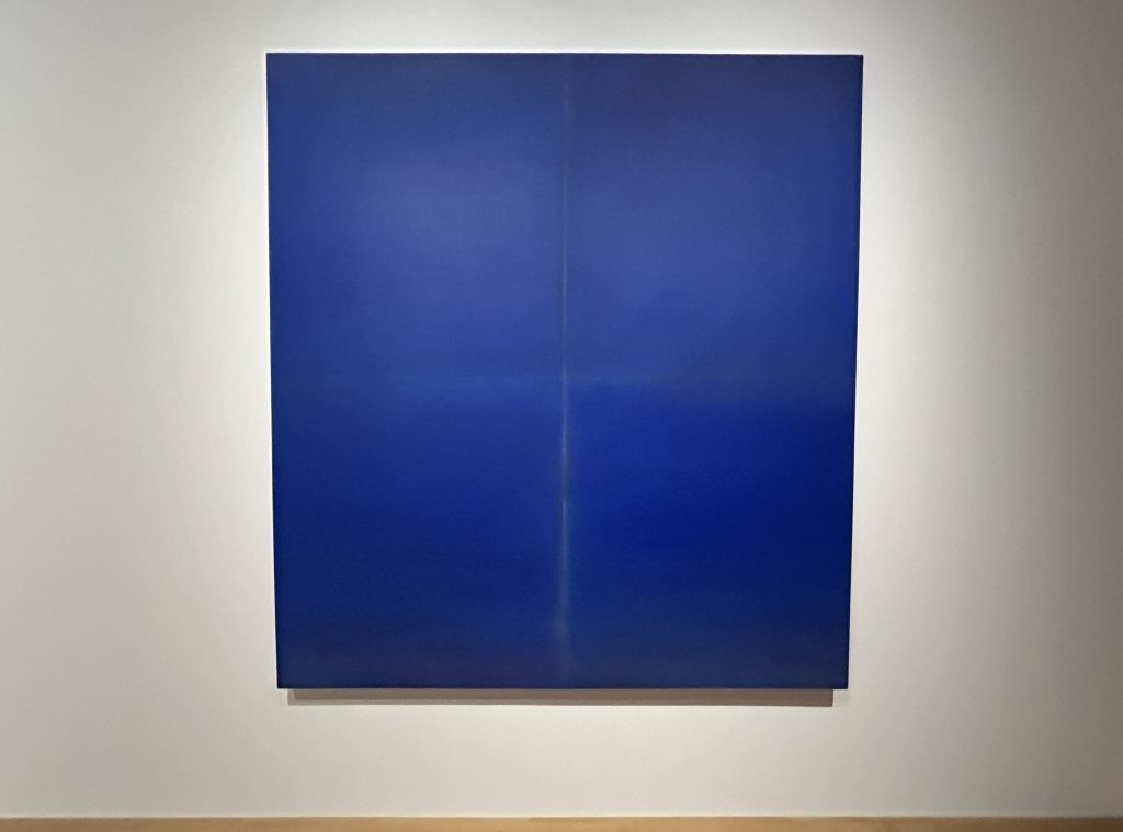
In contrast, the work Maeda exhibited at the Pola Museum of Art was primarily composed in shades of blue. However, his production process is likely entirely different from that of Kapoor. At the center of the painting are vertical and horizontal lines, and while the surface may appear uniform at first glance, a closer look reveals multiple layers. Using a brush similar to a hake brush, Maeda repeatedly applies acrylic paint, always reversing direction without crossing the central cross-shaped lines. But that’s not all. After applying color, he exposes the work to the elements in the garden of his studio—letting it weather in the rain and wind. During this time, mud seeps in, the surface fades or becomes stained. He then washes it with water, lets it dry, and applies color again.
To the viewer encountering the finished work, Maeda’s complex production process isn’t readily apparent. But one senses that the color is more than just blue—there’s a certain presence in the surface, something like “air” that’s difficult to describe as texture. When I saw it, I wrote that it resembled “a sky where sunlight, heavy with moisture, scatters.” Still, if you were to compare it to the actual sky, it wouldn’t reach such a deep, saturated blue. It’s a purplish hue, perhaps best described as ultramarine, with a distinctive glow. This luminosity may be partly due to the way the back of the canvas is coated to prevent overabsorption, and to the use of mineral-based pigments that further enhance its radiance.
Nobuaki Maeda, UB21-0210, 2021
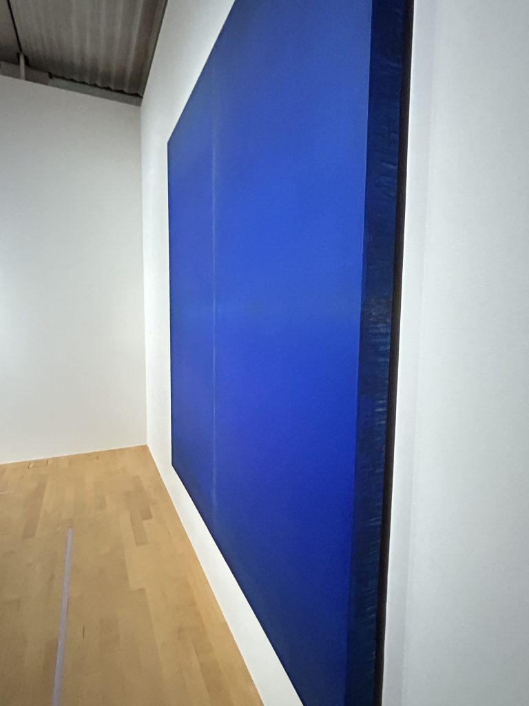
Side View of UB21-0210 by Nobuaki Maeda
At the end of the layering process, Maeda scratched over a vertical pencil line drawn on top of the paint, making the line appear either as a beam of light opening onto a space beyond, or as a glowing thread dangling from above. The work itself, roughly 7.5 cm thick and mounted to float about 2 cm away from the wall, gives the impression of hovering in midair. What’s especially important here is the way attention is drawn to the sides of the canvas. Ordinarily, the sides of a canvas are hidden when a piece is framed, and even if left visible, they’re generally treated as something not to be looked at—an unspoken assumption. However, if the work is considered as an object, the sides are part of what is meant to be seen, and Maeda intentionally highlights this by giving the canvas more depth than usual and suspending it from the wall. A close look at the sides reveals traces of multiple layers of different paints, making the process by which the painting came into being visible. This also testifies to the consistency of Maeda’s artistic stance, evident since the 1970s when he was one of the first to experiment with process art using a Xerox copier.
Today, Maeda may be said to occupy a unique position. In 1970, he witnessed the Tokyo Biennale exhibit Between Man and Matter, where he participated as an assistant to Tanaka Shintaro, a member of the Neo-Dada Organizers and later a representative for Japan at the 1972 Venice Biennale. There, he saw firsthand the installation work of figures such as Richard Serra, Carl Andre, Jannis Kounellis of Arte Povera, and Narita Katsuhiko of Mono-ha. He also developed a personal relationship with Narita, a fellow native of his hometown, Kumamoto, maintaining contact with him until Narita’s later years. Maeda has long followed developments in American Minimal Art, frequently traveling to the U.S. and maintaining a relationship with Kuwayama Tadaaki as well.
However, after graduating from university, Maeda returned to his hometown and worked as a junior high and high school teacher while awaiting an opportunity to go to the United States. Following his marriage and the birth of his children, he continued his artistic practice based in Kumamoto. Later, he shifted his focus to the rapidly emerging art scene in South Korea. In recent years, he deepened his connections with artists working in “monochrome painting,” including the late, widely respected Park Seo-bo.
Certainly, on the surface, Maeda might appear as a reductive artist influenced by Color Field painting, Minimalism, or the Mono-ha movement. For example, the scratched, luminous lines recall Dan Flavin’s vertically installed fluorescent lights, whom Maeda was especially drawn to, not just Mark Rothko or Barnett Newman. His distinctive shallow, box-like canvases bring to mind Donald Judd’s cubic objects. In the Colors exhibition, Judd’s and Kuwayama’s works were displayed in the room in front of Maeda’s pieces, while Flavin’s works were exhibited in the adjacent room, highlighting their reciprocal dialogue.
However, Kumamoto’s geographic proximity to the continent, its abundant underground water, which is among the richest in Japan, and its beautiful natural and living environment make Maeda’s philosophy and work unique. As Maeda says, “Water is also a kind of paint.” He uses the plentiful underground water to wash the exposed canvases and apply acrylic paint. Naturally, the falling rain is also part of this cycle. This process wouldn’t be possible with oil painting. It is acrylic paint that makes it feasible.
Kumamoto’s soft water, low in impurities, is clear and free of cloudiness, resulting in vivid color development. Maeda’s deliberate process of staining and aging the canvas is likely a unique technique he developed through experience to add depth to the vibrant acrylic paints. Even when layering two to four colors of different hues, the colors do not become muddy. This allows the painting’s matière (surface texture) to avoid roughness; instead, it remains flat while producing subtle internal fluctuations.
The relationship between water and paint here is similar to the relationship between water and ink in sumi-e (ink wash) painting. For example, in Northern Song Dynasty paintings, the use of hard water limited the ink’s bleeding, resulting in a somewhat subdued surface that may have influenced the paintings’ weighty style. In contrast, Southern Song Dynasty paintings used soft water, which allowed the ink to bleed more easily, contributing to a style that emphasized delicate gradations and flowing ink washes. Japan, with a climate and water quality relatively similar to that of the Southern Song, shared this similarity not only culturally but also in terms of its natural environment.
Kumamoto has a high annual rainfall and abundant underground water, along with an atmosphere rich in water vapor that scatters sunlight. This quality of diffused light also influences perception and expression. Maeda’s paintings, which almost seem to exude their own fragrance, can truly be said to embody what he has internalized and made his own in Kumamoto.
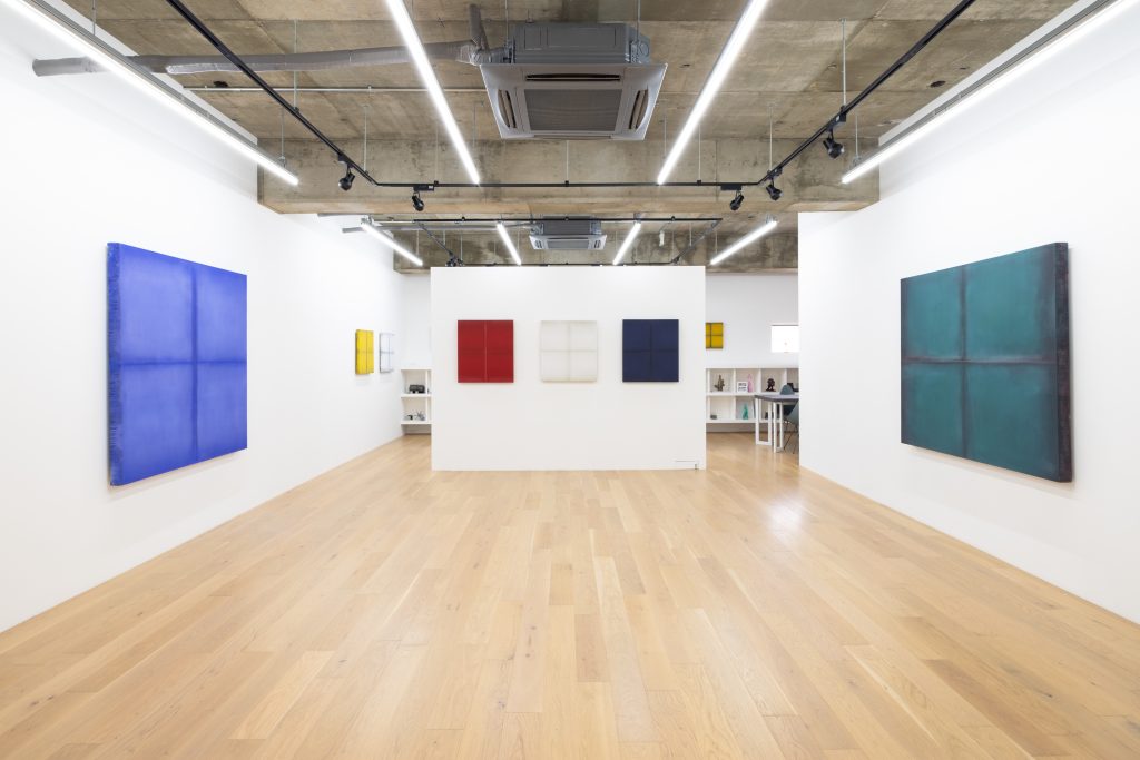
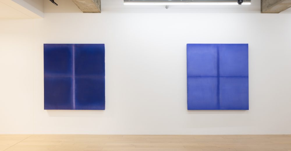
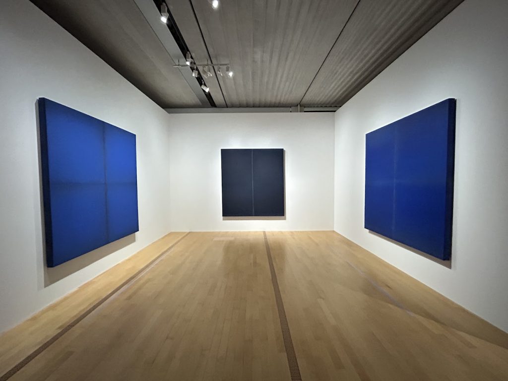
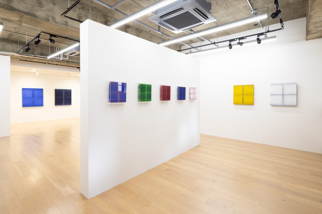
Exhibition View of “Permeating Color, 2025” (TEZUKAYAMA GALLERY) Photo: Hyogo Magyuda
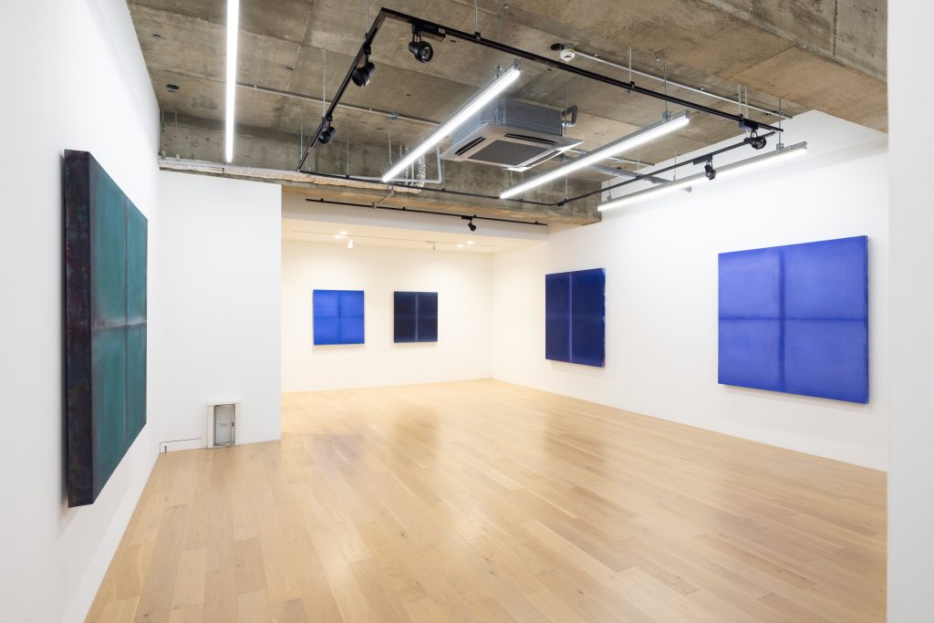
Exhibition View of “Permeating Color, 2025” (TEZUKAYAMA GALLERY) Photo: Hyogo Magyuda
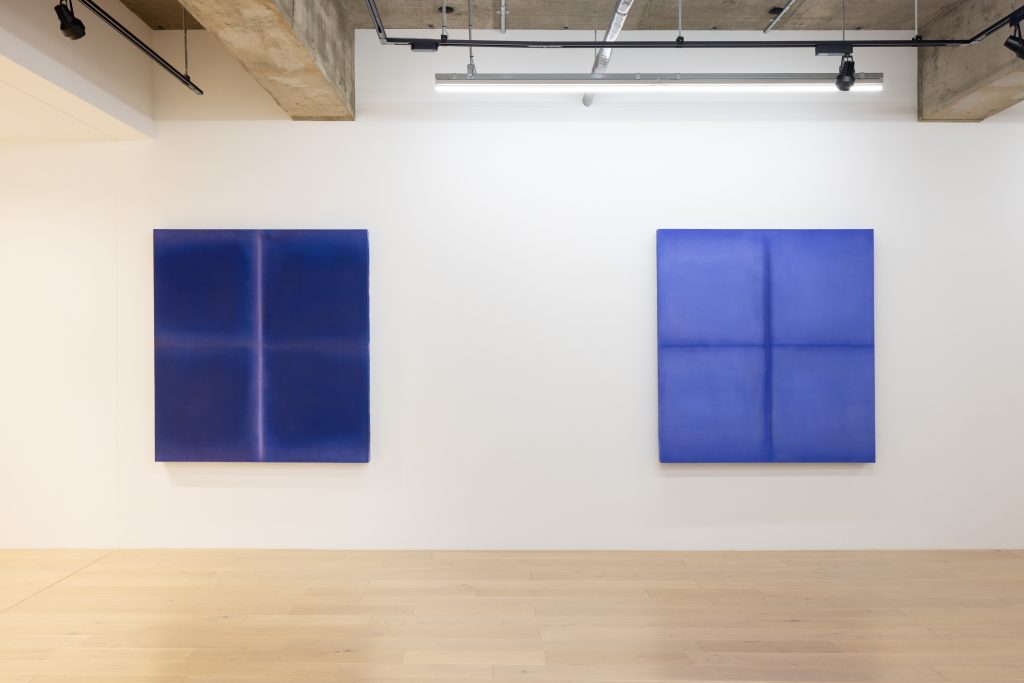
Exhibition View of “Permeating Color, 2025” (TEZUKAYAMA GALLERY) Photo: Hyogo Magyuda
For his first solo exhibition in Osaka, Maeda aimed to present relatively vivid works in response to the city’s vibrant character. Indeed, this show includes a number of brightly colored pieces not seen in the earlier Colors exhibition. In contrast, his smaller works use finely woven linen rather than cotton canvas, which allows the paint to soak in more easily, creating a surface that appears to shimmer with rising vapor. This effect gives the paintings an Eastern, almost sansui (landscape painting) quality. In Maeda’s work, the viewer experiences a perceptual shift, finding elements of Eastern aesthetics within the trajectory of abstract painting that had reached its apex in postwar American art. It is reminiscent of the taikyokuzu (yin-yang symbol), in which the seed of yin emerges at the height of yang, and yang begins to bud within the flow of yin—an eternal cycle of balance and transformation.
Exhibition View of “Permeating Color, 2025” (TEZUKAYAMA GALLERY) Photo: Hyogo Magyuda
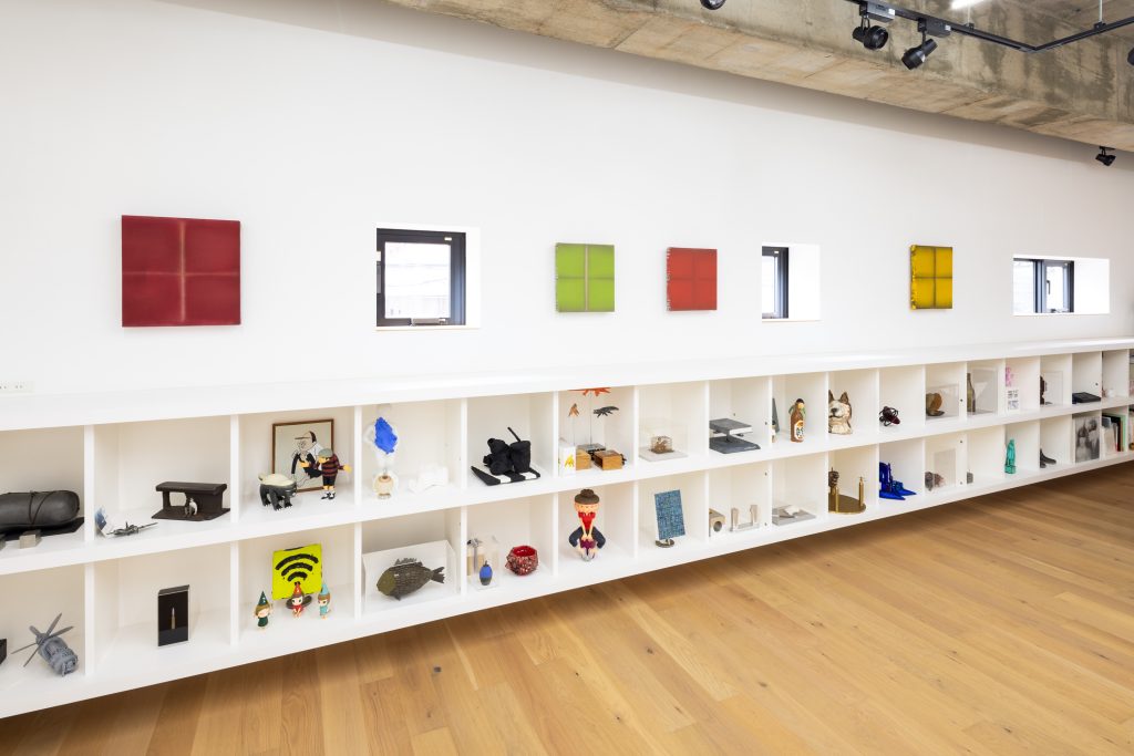
Exhibition View of “Permeating Color, 2025” (TEZUKAYAMA GALLERY) Photo: Hyogo Magyuda
As seen in the Colors exhibition and this current show, for Maeda, exhibiting paintings is an act of reconstructing the relationship between space and people. By hanging works, carefully calibrated in scale and color, within the unique, often imperceptible atmosphere shaped by wall size, ceiling height, materials, and the venue’s mood, he introduces new elements into the space: a window, a beam of light, or a magnetic field. The vertical and horizontal lines crossing the center, the canvas’s thickness and slight separation from the wall, and the varied hues extend into the space, creating palpable tension. Simultaneously, colors seeping from the layered surfaces gently dissolve that tension. This subtle orchestration of perception and atmosphere lies at the core of Maeda’s work.
Maeda’s paintings can be seen as works that symbolically connect America and Asia, two regions divided by the Pacific Ocean. The vertical and horizontal lines evoke Western symbolism, such as the sublime or the cross, but at the same time, they can also be seen as a vertical line linking the sky and the sea, and a horizontal line representing the horizon, all surrounded by a soft, enveloping light. Alternatively, the vertical line might symbolically stand for the West, and the horizontal line for the East. What remains certain is that Maeda’s paintings are not cold or detached; rather, they are a rich blessing created through the collaborative work of nature and humanity.
Translation:Todd Goldman, Nao Tazaki